Free tips to work smarter, quarterly!
Get insights on how to automate your business, improve customer experience, and create more free time for yourself!

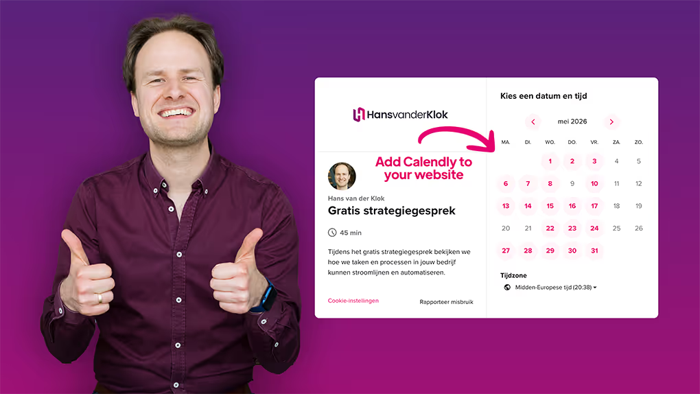
Calendly has revolutionized the way people schedule meetings and appointments. But did you know that you can take your Calendly experience a step further by incorporating your brand color to your scheduling links?
In this article, I'll tell you how to add your brand color to Calendly. This makes your brand recognizable and creates a professional appearance to clients and colleagues.
Please note: this feature is only available to users with a paid Calendly account.
Why consistent use of your brand color is important
Your brand identity is how your brand looks and feels. It includes not only your logo and slogan, but also the values, personality and professional image your brand represents.
By adding your brand color to your Calendly link, you not only strengthen your brand identity but also create a consistent and professional experience for your customers, setting yourself apart from the crowd. Many people use Calendly's default settings, but you stand out with a unique scheduling page that grabs attention.
Adding your brand color to Calendly's scheduling page
Follow these steps to customize Calendly with your brand color:
- Select your brand color: Choose the primary color from your brand's color palette that best represents your brand identity.
- Navigate to your Calendly dashboard: Locate the event type you'd like to share. Click "Copy link" to copy the URL to your clipboard.
- Customize your Calendly link: Open a text editor or email where you want to add your Calendly link. Paste the link you copied from Calendly.
- Add your brand color: Add a question mark "?" at the end of the URL to indicate the beginning of parameters. Then add the variable "brand_color", followed by your brand's color code. For example, if your brand color is pink (#e60070), your link will look like this: https://calendly.com/yourname/your-event?primary_color=e60070.
- Preview your customized link: Paste the modified link into a web browser to preview and ensure that the color has been applied as desired.
And just like that, your Calendly scheduling page reflects your brand's identity with its own unique color. It may seem like a small detail, but it makes a world of difference.
Do you want more useful tips?
- Discover more free videos and articles on Calendly with practical tips and insights.
- Watch my latest Calendly course (in Dutch) and explore strategies to manage your appointments even more efficiently, leaving you more time for what really matters.
- Learn about my one-on-one support and discover how I can personally help you streamline and automate your processes.


